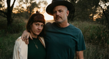
Today is a great day to share the new single from Crow and Gazelle called “The Only Thing.” The song comes from the band’s new LP, As Above Now So Below, that releases everywhere music is sold on April 26th. The band shared:
When I used to volunteer in the max ward of the jail in Austin, I would sing this chorus to the women in our closing circle, where we worked to heal trauma, every week. In the context of this album, the words of this song fit the theme of love helping us to heal and to recover…A song of love, but not just to another… this one, especially the first part, is often sung to myself–to the part of me that I have recovered and reclaimed, which was torn apart as a child. She is the one who helps drive out the demons of the past. Because I want to give her that power, now, just as I want to give it to anyone who has suffered at the hands of another. To undo, unlearn, and draw attention to the truth of our worth, through songs like this and the rest of this album, feels like ‘the only thing I’ve done right.’ Not literally of course, but it feels like the most right thing I could do, at this very moment. Love brought us both to this place–it empowered us to find our truth, and to share it.
If you’re enjoying the early listen, you can pre-save the new LP here.
Read More “Crow and Gazelle – “The Only Thing” (Song Premiere)”